

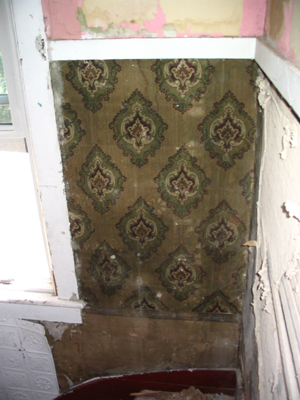
When we gutted the hallway, we found some gorgeous wallpaper samples. It was badly damaged and falling to pieces, but I did manage to get some good photos of it before we decimated things.
Here, you can see how it was applied – it may have gone all the way up the wall at some time point, since the pattern was not centered vertically. In this photo, you can see where the bottom border area starts:
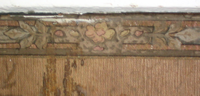
Here’s a close-up of the border – a very cute floral pattern that repeats the greens and tans found above, but also mixes in some pastels:
Below the border the design is bark-like jaggedy lines in a light burnt-umber color. The darker areas toward the left are just stains.
Here is a great close-up of the main pattern; you can see the bark-like design repeats behind the main element. According to this site, it’s a “Victorian Baroque” design and quite a bit earlier than our house supposedly dates to…..
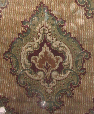
If you’re like me, you’re always looking for color inspiration. I thought this design was a perfect sample to pull an authentic color scheme from, so I whipped out my trusty Photoshop eyedropper and grabbed the dominating colors to share with the world. So here it is, my friends – a truly authentic color palette!

For more on Victorian Wallpapers, and ours in particular, check out these older posts:
Cupola Exploration (more original wallpaper samples)
Reproduction Wallpaper (Resources)
Comments, Thoughts, and Feedback
Wow–I like the colors…and the paper. Nice little find.
When I look at Bradbury and Bradbury paper, I have often thought that most Victorians probably were not that elaborate in the designs…and then you see a picture like yours and you realize that they probably WERE that eloborate–it’s over the years the layers were stripped off.
Neat little archeological find.
Wow, that’s cool. I have to learn how to use Photoshop better. My abilities are pretty much limited to resizing images. I’ve got some similar wallpaper pictures on my camera from gutting out place, I’ve got to get them uploaded. I don’t plan to replicate the technique of wallpapering anything that doesn’t move, but borrowing the color palate is a really good idea.
Neato! Interesting … that is similar to our possible color palette for the bathroom. Hmm.
P.S. I am addicted to the Photoshop eyedropper tool.
beautiful. i’m a big fan of yours and i’ve been lurking for a while. i love these archaeological discoveries, and your eyedrop color scheme, nice.
Patrick – Yes, the wallpaper we’ve found throughout the house has been very “busy”, with patterns and color schemes that by today’s aesthetic seem mismatched and completely over the top.
In the rooms we’ve found wallpaper in, we usually find one big print (the baroque designs were popular with our original owners) and sometimes (as here) a second blander print. There is usually at least one border in the mix. The stairwell probably had a large border at the ceiling line, but this wall had been replaced prior to our gutting so we will never know. The borders are often much different from the prints – no Laura Ashley super-match here. We also find wallpaper on the ceiling – usually the blandest print in the combos.
The question is, should we learn to love the overwhelming pattern-fest? I’m loving my smoothly painted walls; the good reproduction wallpaper is out of our league at the moment ;)
Nola – the color palette was very easy, you just use the eyedropper tool (looks just like a mini eyedropper) to pull a color out of your wallpaper. That puts it in your palette. Then you use the paint bucket tool to dump that onto your canvas. I made little squares for each of mine and just lined them up side by side!
Kristen – ME TOO. I pull color palettes for my day-to-day design work from everything. Sometimes nature pics like fish, flowers, birds etc. have the best palettes!
purejuice – Glad you’re a fan, and thanks for commenting! I’ll try to include more of this type of post – one of my goals is to unearth more about the history of this house.
Love the color palette! I’m going to second purjuice’s request to see a color palette of the wallpaper you found in the cupola. I think that’s also a gorgeous image.
Thanks for sharing :)
I have a small hall that I am redecorating, it is far from victorian,I would love to give it a touch of victorian colour scheme. I have done the ceiling and doors in a very warm gray,any suggestions on colour for the trim and walls? I might add that I would like the bottom half of walls to be the same colour as trim and the top a differant shade, oh by the way walls will be papered, with a architectural inspiration vinyl wallcovering. Any suggestions?
We love to hear from you, dear readers.